Health Tech
Data Visualization
Design Systems
Mobile Design
Wearables Integration
Mobile Design (iOS)
August 2022 – March 2023
I ran a full product redesign, UX overhaul, and Design System build simultaneously and shipped a platform that improved training efficiency by 61% for beginners and 24% for mid-level athletes.

Most designers would have done these one at a time. We didn't have that luxury. And honestly, the constraint made the product better.
Applied Skills
End-to-end Product Design
Token-based Design System
Information Architecture
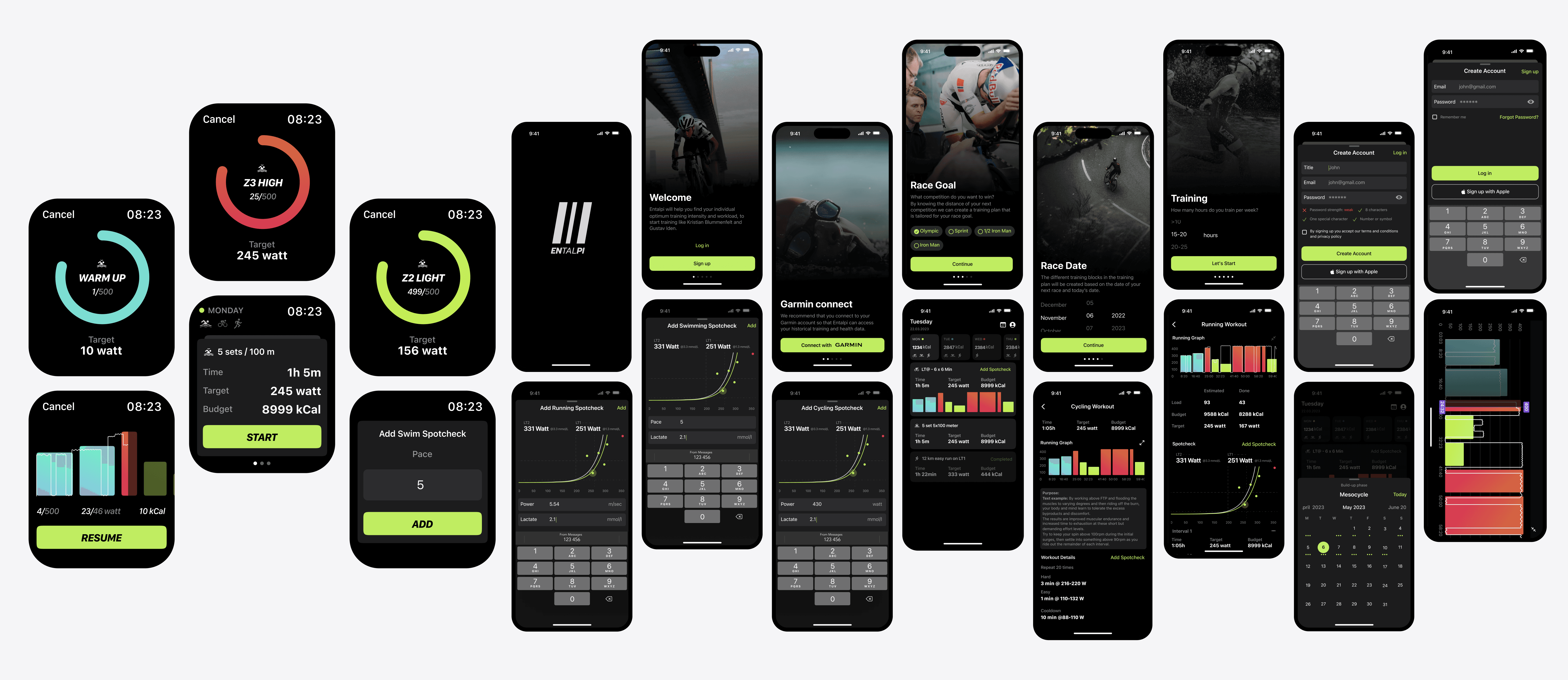
Wearables Integration (Apple Watch)
User Research
User Journey Mapping
User Stories
Wireframing
High-Fidelity Prototyping
Competitive Analysis
Health & Fitness Tech
Data Visualization
Process Leadership
Platform
Mobile Design (iOS)
Timeline
August 2022 – March 2023
Effect

Entalpi is built on the same training science that produced Gustav Iden and Casper Stornes two of the best endurance athletes in the world. The idea is simple: your body has a lactate threshold, and if you train around it correctly, you get faster. Not through grinding more hours, but through training smarter.
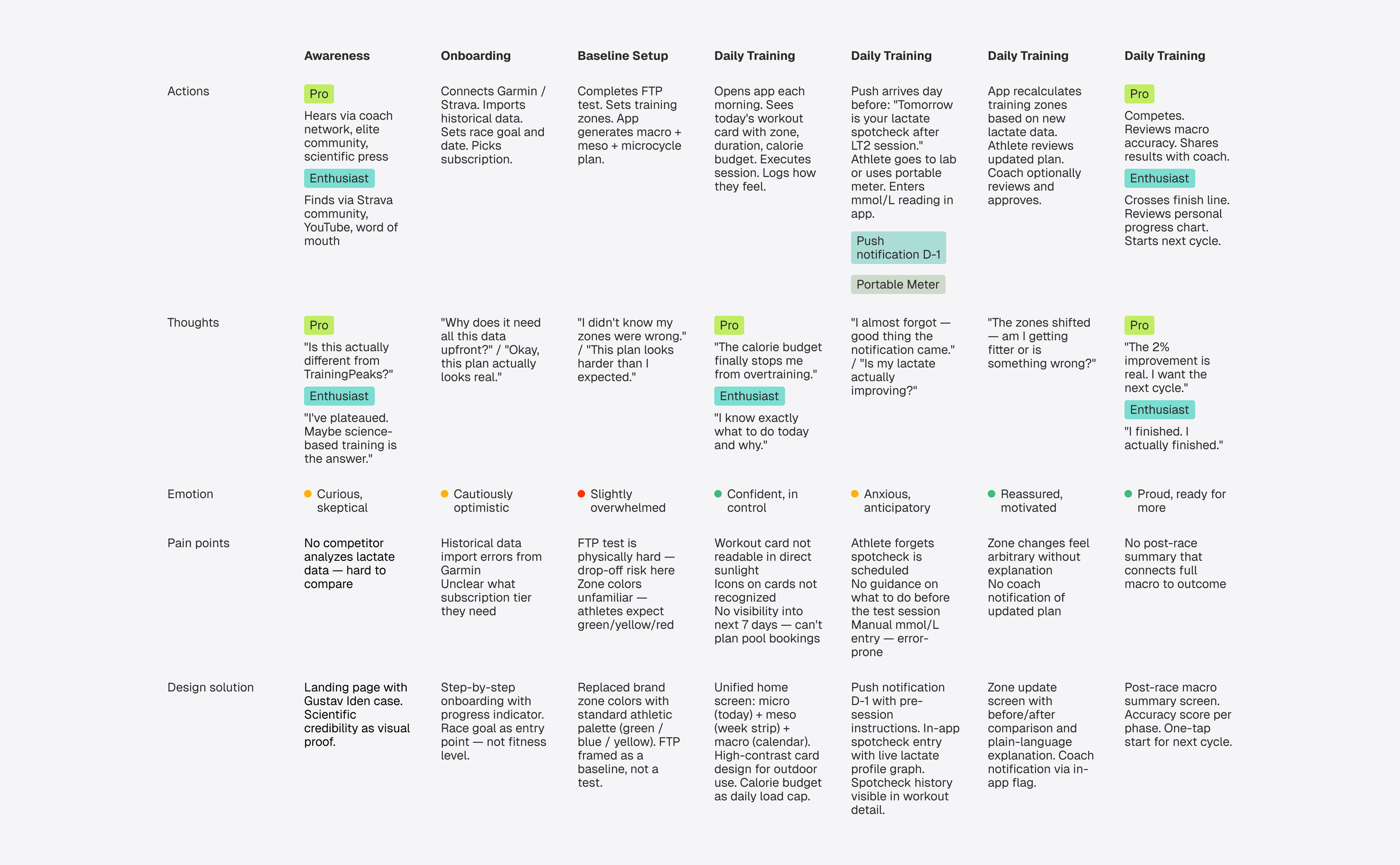
The problem was that none of that science was actually legible inside the product. Athletes would open the app and have no idea how hard today should be. They'd look at their workout card and not understand what the intensity colors meant. They'd finish a session and have no sense of whether it was good or just... done. And every three weeks, they were supposed to do a lactate spotcheck a specific blood test after a specific workout but nobody was reminding them the day before, so they'd miss it and the whole calibration cycle would break.
Seven distinct problems, all quietly destroying the user experience:
No daily load limit athletes were overtraining because nothing told them to stop
Lactate data existed somewhere in the system, disconnected from the training plan
No view of the upcoming week a swimmer couldn't book a pool lane because they didn't know Wednesday had a swim session
FTP tests weren't feeding back into zone adjustments
Workout cards were unreadable in sunlight
Intensity zone colors were Entalpi brand colors not the green/yellow/red that every Garmin user already knows
And zero coherent view across day, week, and competition phase all three lived in completely separate places
The product was backed by world-class science and used by world champions. But at the moment of daily use, it was letting people down.
Rationale
Before touching a single screen, I mapped the competitive landscape. TrainingPeaks, Intervals.icu, Strava, Apple Fitness+ five apps, same scoring framework, same questions: can you analyze lactate data? Can you run FTP tests? Do you actually adapt the plan over time?
Capability | Intervals | Training Peacks | Strava | Apple Fitness + |
|---|---|---|---|---|
Lactate Meter Analysis | No | No | No | No |
FTP Testing | No | No | No | No |
Adaptive Training Plans | Yes | Yes | No | No |
Wearables integration | Broad | Broad | Broad | Apple Watch |
Multi-sport support | No | Yes | No | Yes |
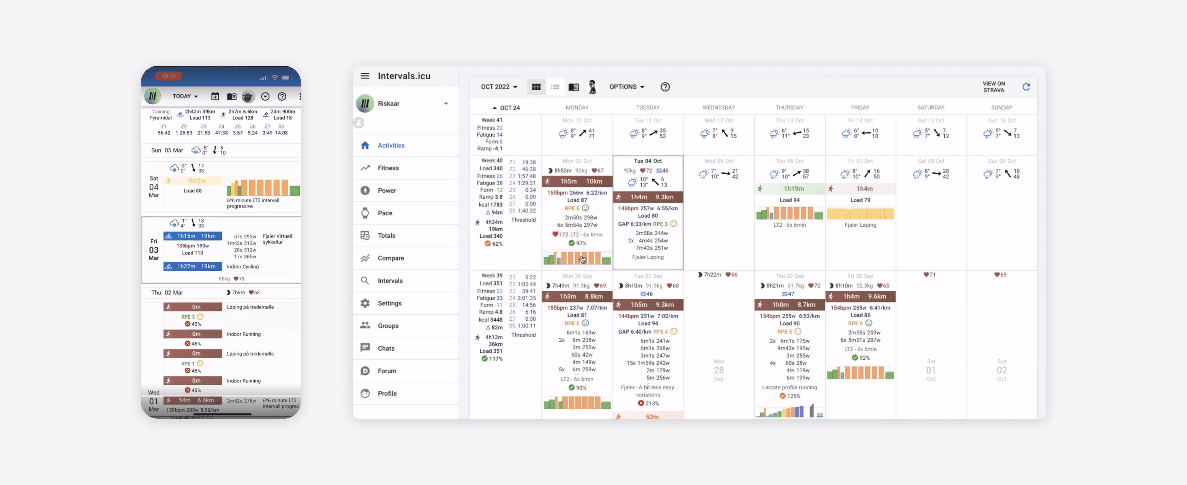
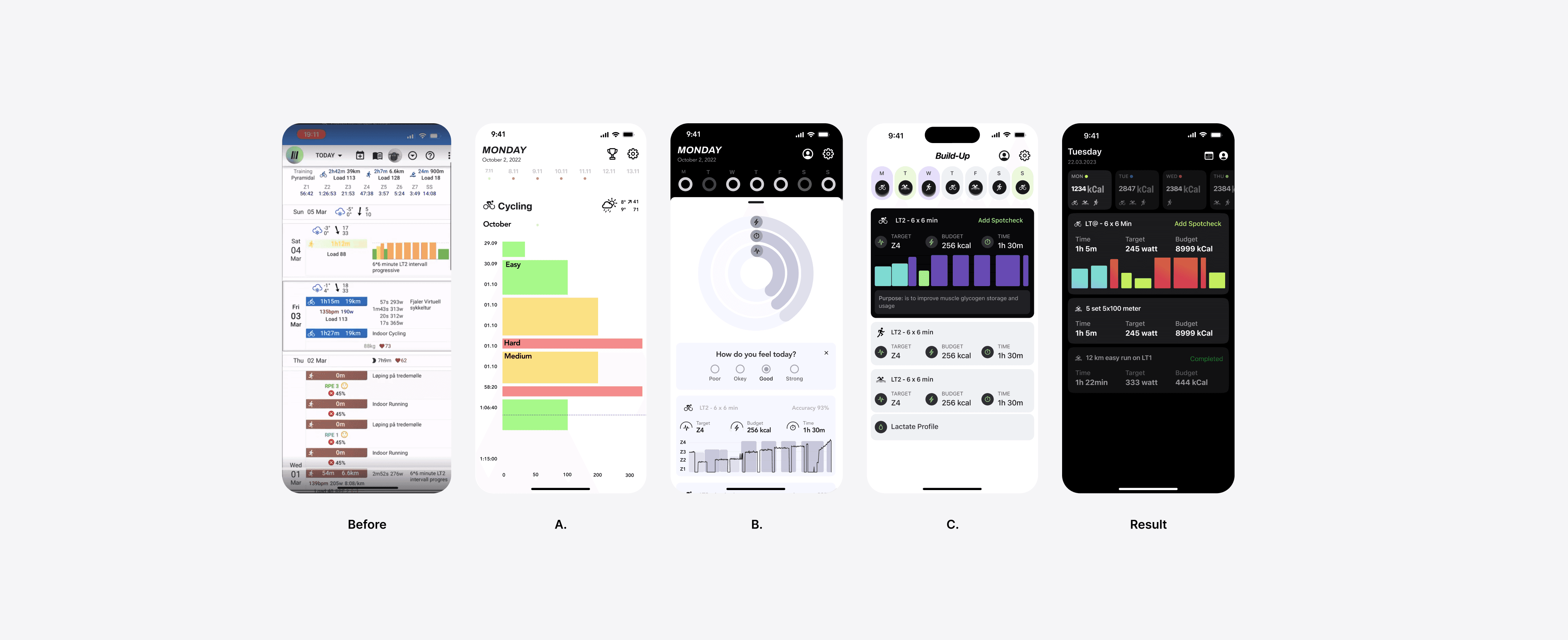
Not one competitor could analyze lactate data. That was the moat. The design problem was making it real accessible without losing the science that made it valuable. The biggest structural decision was about navigation. The obvious answer was tabs: one screen for today, one for the week, one for the full plan. Clean, conventional, safe. I pushed back. Athletes don't think in tabs. They think in time what's today, what's this week, what's the build toward race day. A unified home screen that surfaces all three layers in one scroll felt closer to how a real training day actually works. Every usability session backed this up. We kept the unified architecture. The other decision was about sequencing. Running redesign, UX, and Design System at the same time was genuinely risky. The safer path was to do them in order. But doing them in order would have taken over a year and the product needed help now. So I proposed building the Design System as the redesign happened, screen by screen, decision by decision. Every component we built was grounded in a real product problem, not a hypothetical future use case.
Operations
Understanding who we were designing for.
Two very different people use Entalpi. One is a professional Olympic-level athlete full-time training, coaches, labs, the works. They need granular data, they want to know exactly why each session exists, and they're training toward a specific competition date that cannot move.
The other is someone like a 28-year-old marketing manager who runs before work and is trying to finish their first half marathon. They've plateaued. They don't know why. They're hoping science can help.
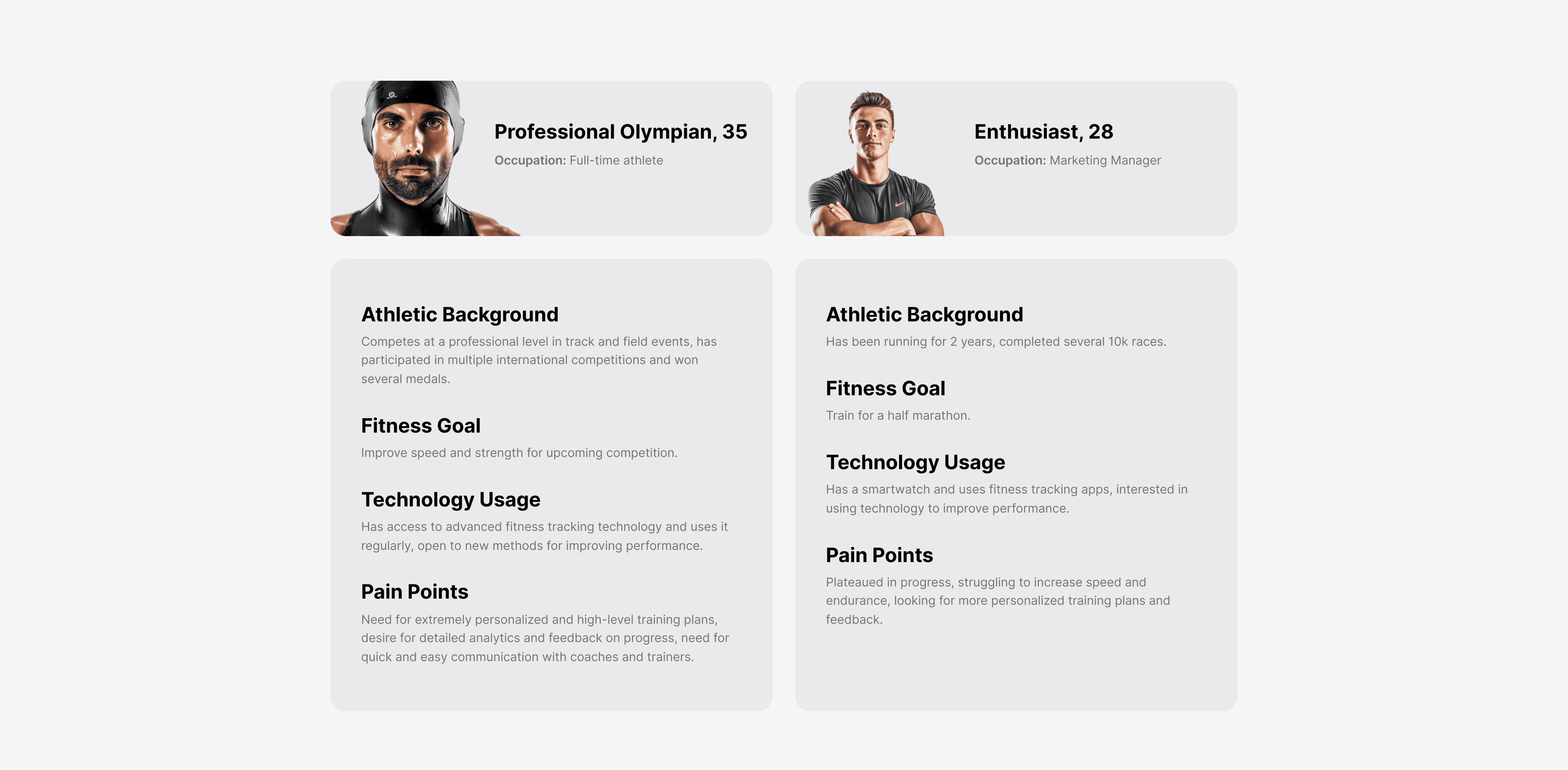
I mapped both journeys across six stages from the moment they first heard about Entalpi to the moment they crossed a finish line and decided whether to start the next cycle. The map covered what they did, what they were thinking, what they felt, where they got stuck, and what the design needed to do about each of those moments.
The lactate spotcheck cycle got its own stage in the map. Every three weeks, after a specific LT2 session, athletes are supposed to go to a lab or use a portable meter and record their blood lactate level. That reading is what recalibrates everything. Without it, the training plan is just guessing. The problem was that athletes were forgetting. So we built a push notification that arrives the day before with pre-session prep instructions and an in-app entry flow with a live lactate profile graph so athletes could see their result in context immediately after entering it.
After, I've compiled a mood board to discuss with stakeholders and gather their feedback on the direction.
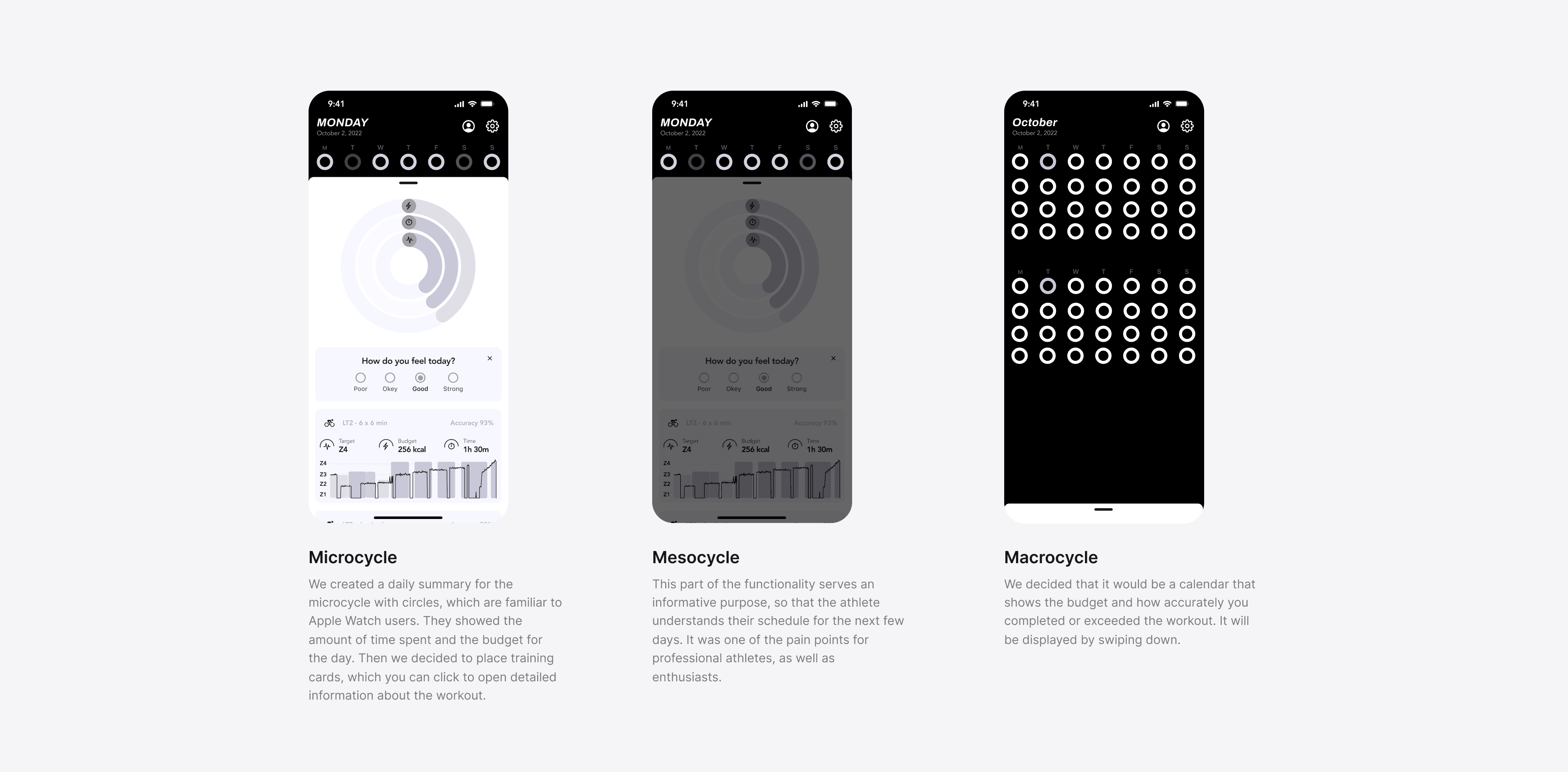
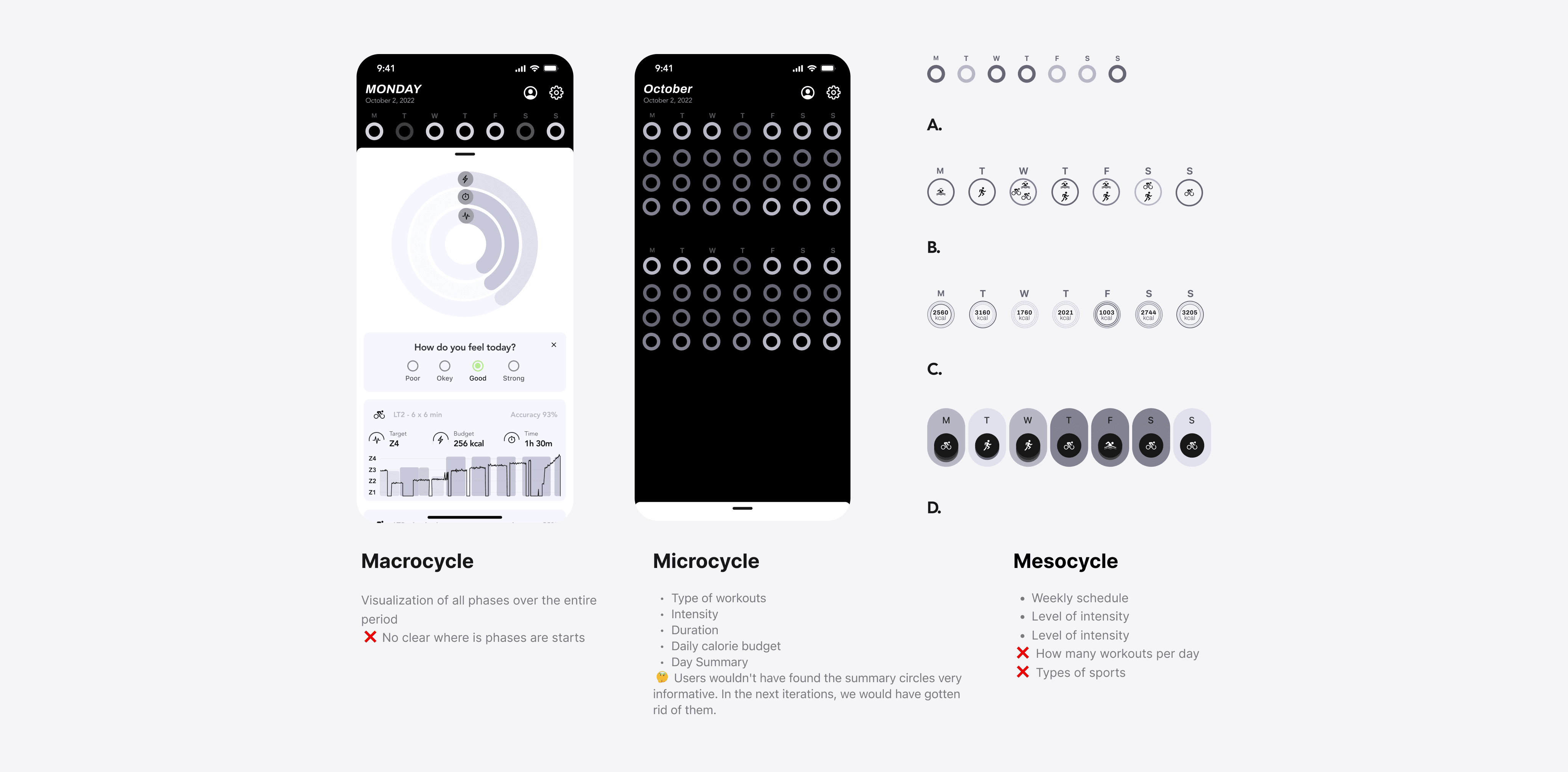
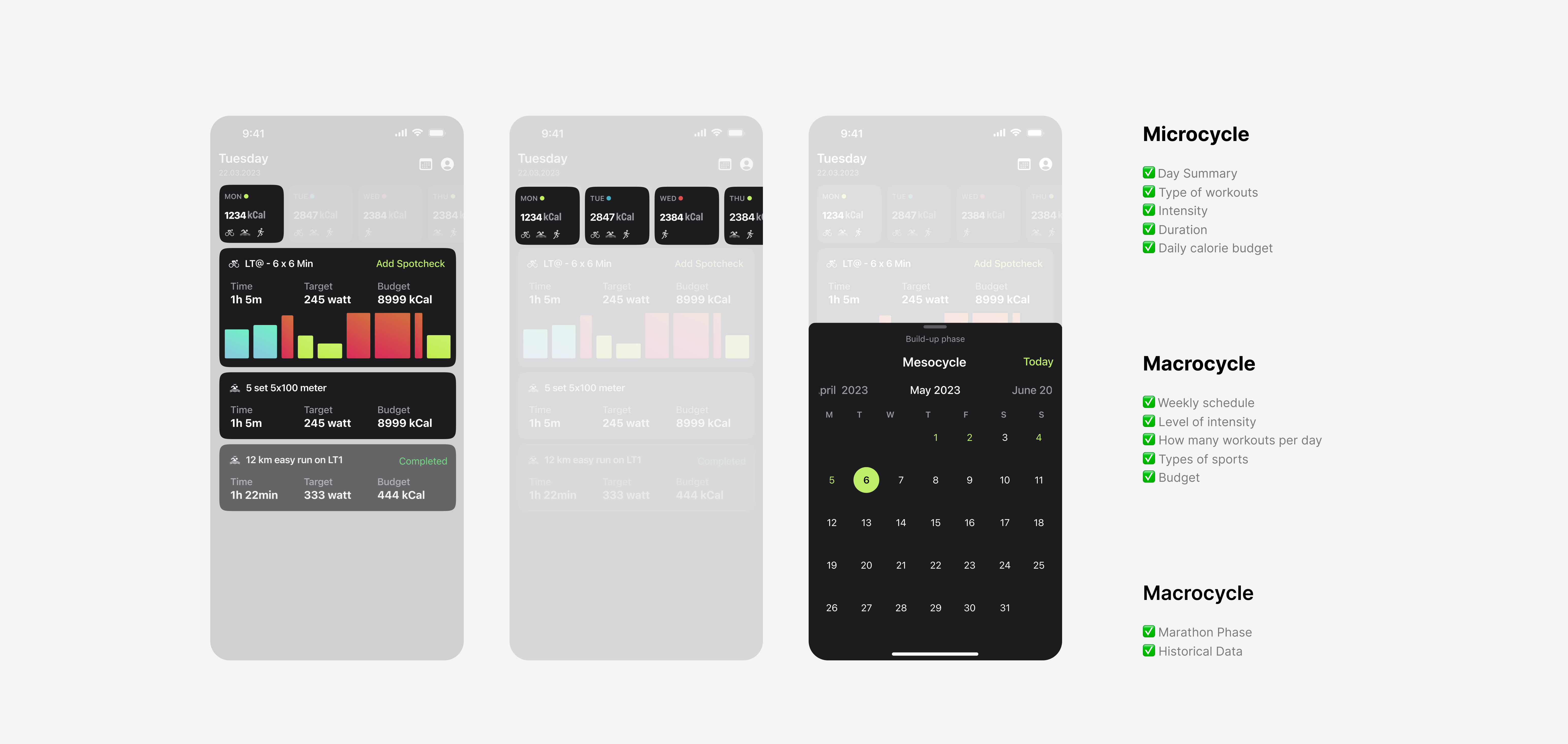
One screen. Three time horizons. The home screen was the hardest thing to get right and the most important thing we built. At the top: today. A workout card with zone, duration, calorie budget, and target watts. Below that, a daily budget indicator a visible cap on total training load. This was the fix for overtraining. If you'd already done a hard morning session and the budget was nearly spent, the card for your afternoon run would show it. Simple, visible, honest. In the middle: this week. A horizontal strip workout type, sport, intensity level, daily budget for the next seven days. Now the swimmer could book the pool. Now the athlete could tell their partner which evenings were going to be long. Below that: the full competition phase. A calendar showing where you were in the build-up, peak, or taper, with historical accuracy data for each session. Athletes could see their training for the past month and understand whether they were on track without asking a coach.
Tested and Reiterate
We tested with real athletes, with a clickable Figma prototype, outdoors when possible. Here's what they told us and what we did about it:
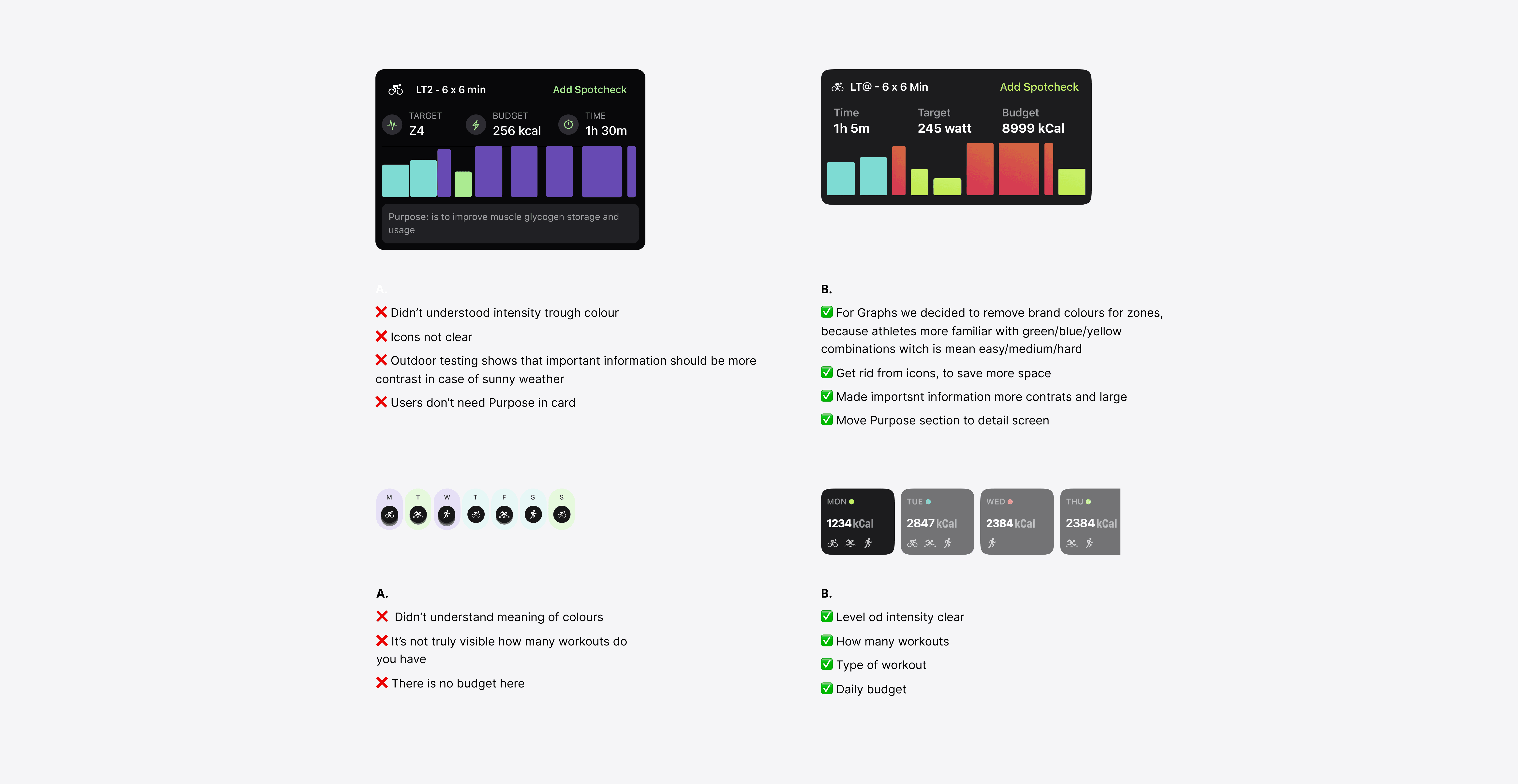
Icons on workout cards weren't recognized. We removed them and used text labels instead. The workout card was unreadable in direct sunlight. We increased contrast significantly and made key numbers larger. The "Purpose" section on each card a description of why this workout matters was being ignored entirely. We moved it to the detail screen where athletes would read it before starting. The mesocycle strip didn't show how many workouts were in a day or what sport they were. Both were added in the final version.
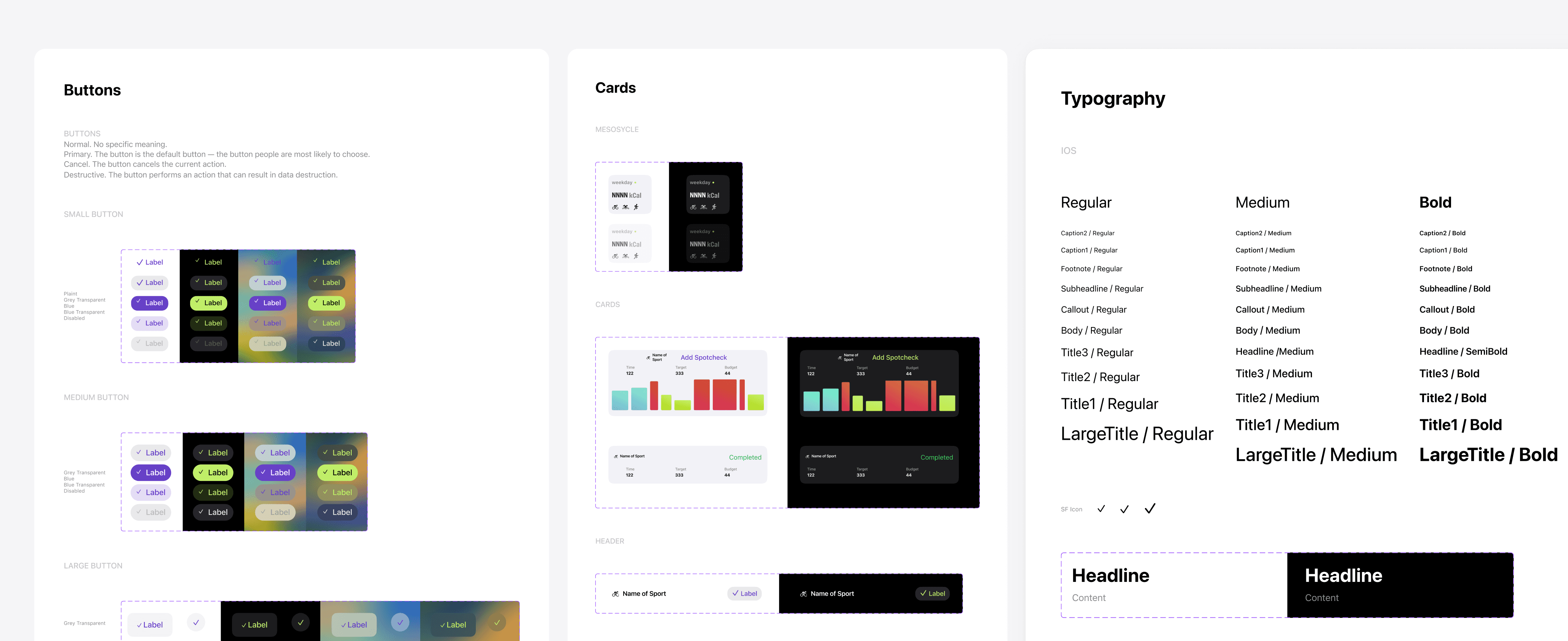
Design System built from scratch, while the product was being redesigned
Every token, every component, every pattern designed for iOS and web simultaneously, documented in Figma with variables and auto-layout, dark and light theme from day one.
The most impactful single decision in the entire system was color. Entalpi had brand colors for training zones. Teal for Zone 2, purple for Zone 4 beautiful, distinctive, completely wrong. Athletes who'd been using Garmin or Polar for years had green/blue/yellow hardwired into their muscle memory. Showing them a teal workout card in Zone 2 meant they had to think. And in the middle of a hard session, thinking costs watts.
We switched to the standard athletic zone palette. Green for easy, blue for moderate, yellow for threshold, red for hard. Comprehension errors dropped immediately in usability testing.
Outcome
Eight months. Fifty-seven screens. Three parallel workstreams. And results that held up:
Athlete Level | Training Efficiency impovement |
|---|---|
Beginner athletes | +61% |
Mid-level athletes | +24% |
Professional athletes | +2% |
The +2% for professionals sounds modest until you understand that these athletes are already operating at the edge of what's physically possible. Moving them 2% is meaningful. The 61% for beginners reflects what happens when someone who's been training on instinct suddenly has a system they stop wasting sessions. Gustav Iden, two-time Ironman 70.3 World Champion, uses this platform as part of his methodology. So does Casper Stornes, ITU World Triathlon Bermuda winner. Running all three workstreams in parallel doubled the complexity of the project. It also halved the timeline. The company doubled its investment in the redesign, reduced production costs, and used the increased valuation in subsequent fundraising negotiations.
What I'd Do Differently
The biggest lesson was sequencing. Building the Design System at the same time as the redesign was the right call for the timeline but it created friction in the early weeks when neither was stable enough to build on. If I had more time, I'd build the system on top of the existing design first, lock it, then redesign. In that order. The second thing: democratic design is a myth at scale. I tried to keep the process open and collaborative across the whole team. After a few iterations it became clear that someone needed to own the final call otherwise you get four good ideas that cancel each other out. I should have set that up earlier. And the summary circles on the daily view we suspected they weren't working before launch. We didn't have the data to remove them. I'd instrument that kind of thing from day one now.


