Product Design
Metrics Driven UX
Onboarding
A/B Testing
Motion Design
iOS Android (Flutter)
Social / AI Companion App
Onboarding that actually works: when longer means better. I boosted paid conversion by 3.7 pp and Day 1 retention by 5 pp by making Pheon's onboarding longer a bet that looked wrong on paper but paid off in user quality.

The easiest thing would have been to optimize for what was already working. Instead, I made a deliberate trade: fewer users through the door, in exchange for users who actually stayed and paid.
Applied Skills
End-to-end Product Design
A/B Testing & Experimentation
User Research & Usability Testing
Product Analytics
Competitive Analysis
UX Flow Design
High-Fidelity Prototyping in Figma
Information Architecture
Interaction Design
Success Metrics Definition
Component Library (Figma)
Cross-functional Collaboration
Data Analysis & Interpretation
Platform
iOS Android (Flutter)
Role & Duration
Social / AI Companion App
Effect
Pheon's original onboarding was short by design: 3 4 screens, a name field, and a disclaimer. Completion rate sat at ~95% a metric that looked healthy on every dashboard.
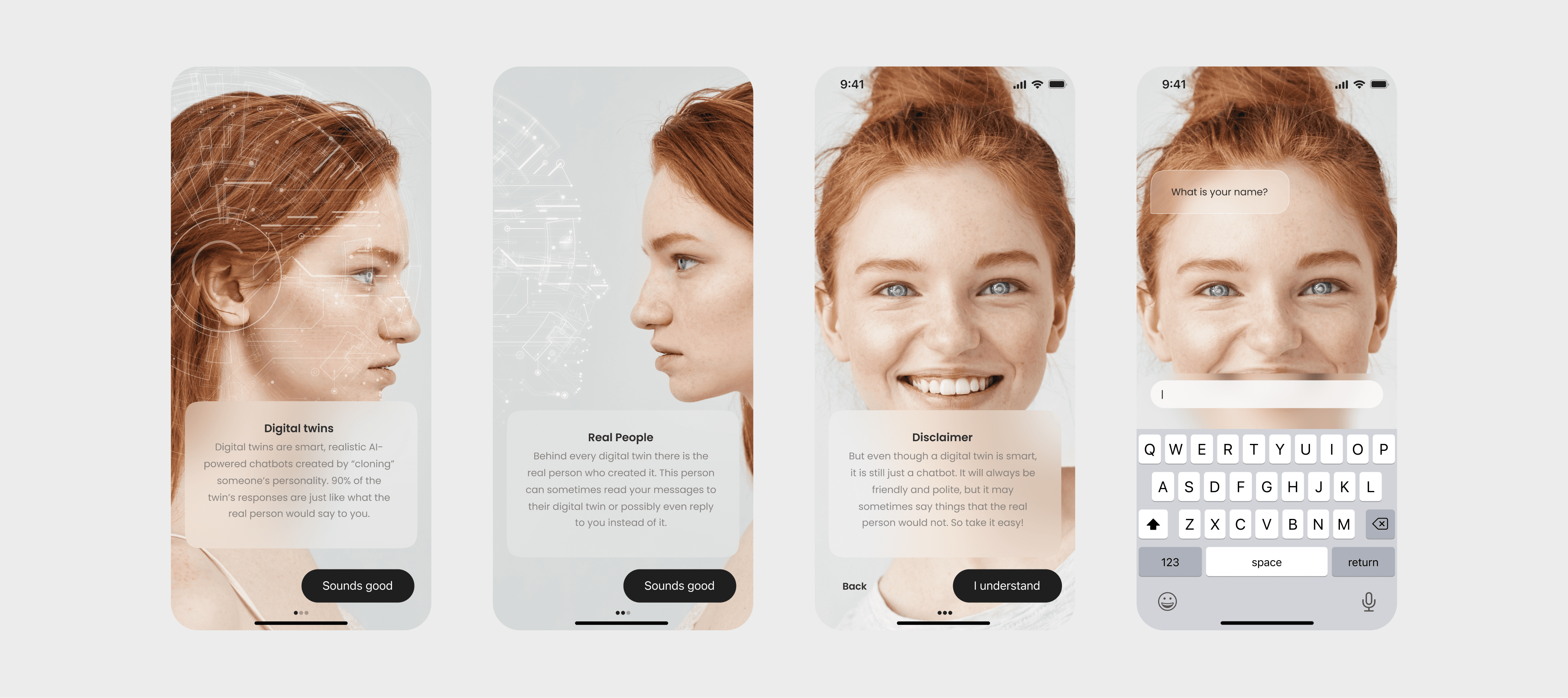
But underneath it, the product was bleeding. Users arrived without context, confused AI characters for real people, failed to find a companion that felt personal, and churned within days. High completion rate masked a deeper problem: we were moving users into the product fast, but not setting them up to stay. Low Day 1 retention was compressing lifetime value, weakening monetization, and making the product unsustainable.
Rationable
Before touching a single screen, I ran a structured competitive analysis across five AI companion apps Replika, Botify AI, Eva AI, Chai, and Blush mapping onboarding length, friction points, character customization depth, trust signals, and paywall placement.
Parameter | Replika | Botyfy AI | Eva AI | Chai | Blush |
|---|---|---|---|---|---|
Onboarding Length | 31 | 19 | 18 | 6 | 25 |
Points of Friction | 20 | 12 | 11 | 3 | 18 |
Character Customization | Very High | High | Medium | Low | Very High |
AI Disclaimer | No | No | No | Yes | Yes |
Paywall Placement | Last Screen | Last Screen | Last Screen | Middle | Last Screen |
The pattern was counterintuitive: the apps with the strongest retention Replika and Blush had the longest onboarding flows, with deep character customization. Chai, the shortest flow, had the weakest retention.
The emotional investment built during setup translated directly into product attachment. The variable that actually drove retention wasn't speed it was depth of personalization.
That insight shaped the core hypothesis: rebuild onboarding around character discovery and personal connection rather than speed-to-first-screen. We'd lose some completions at the top of the funnel but gain significantly higher-quality, higher-LTV users on the other side.
Operations
Discovery
I conducted a structured competitive analysis across five apps using a 5-parameter scoring framework. I mapped information architecture, interaction design patterns, trust signal placement, and monetization positioning across every flow to ground design decisions in evidence rather than instinct.
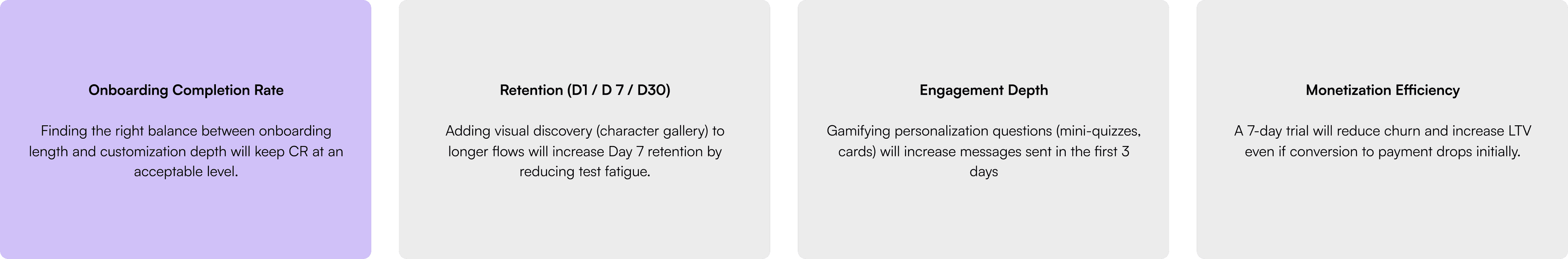
Hypotheses: What we set out to prove
User Research
I ran corridor usability testing with 5 participants using the clickable Figma prototype. Three questions anchored each session: what stood out, where did you feel friction, what sparked genuine interest.
Key findings:
Character selection and trait customization drove the strongest emotional engagement.
A loneliness-focused survey question broke mood and created negative associations.
Notification prompts at the start of the flow were universally rejected Fake-looking reviews undermined trust instead of building it.
Every cut in Iteration 2 was tied to a specific observation not aesthetic preference. The loneliness question, front-loaded notification prompt, and social proof screens were removed. Character selection and customization were protected.
Respondent | Message |
|---|---|
Respondent 1 (Male, 26) | "I liked that you mentioned privacy it makes me feel calmer." "The question about loneliness triggered sad thoughts. I don't want to think about my issues when chatting with an AI." |
Respondent 2 (Female, 32) | "I liked choosing characters it immediately gave me a sense of customization." "The onboarding inspired me to give it a try, even though it's longer than usual." |
Respondent 3 (Male, 21) | "I don't like when apps ask for notifications at the very start. I always press 'Don't Allow'." "The onboarding feels too salesy it would be better with more gamification." |
Respondent 4 (Female, 29) | "I liked choosing characters it immediately gave me a sense of customization." "It's good that I could select topics right away, but the options could be simpler." "I liked the feeling that something unique was being created for me." "The onboarding inspired me to give it a try, even though it's longer than usual." |
Respondent 5 (Male, 32) | "I don't like when apps ask for notifications at the very start. I always press 'Don't Allow'." "The onboarding feels too salesy it would be better with more gamification." |
Design
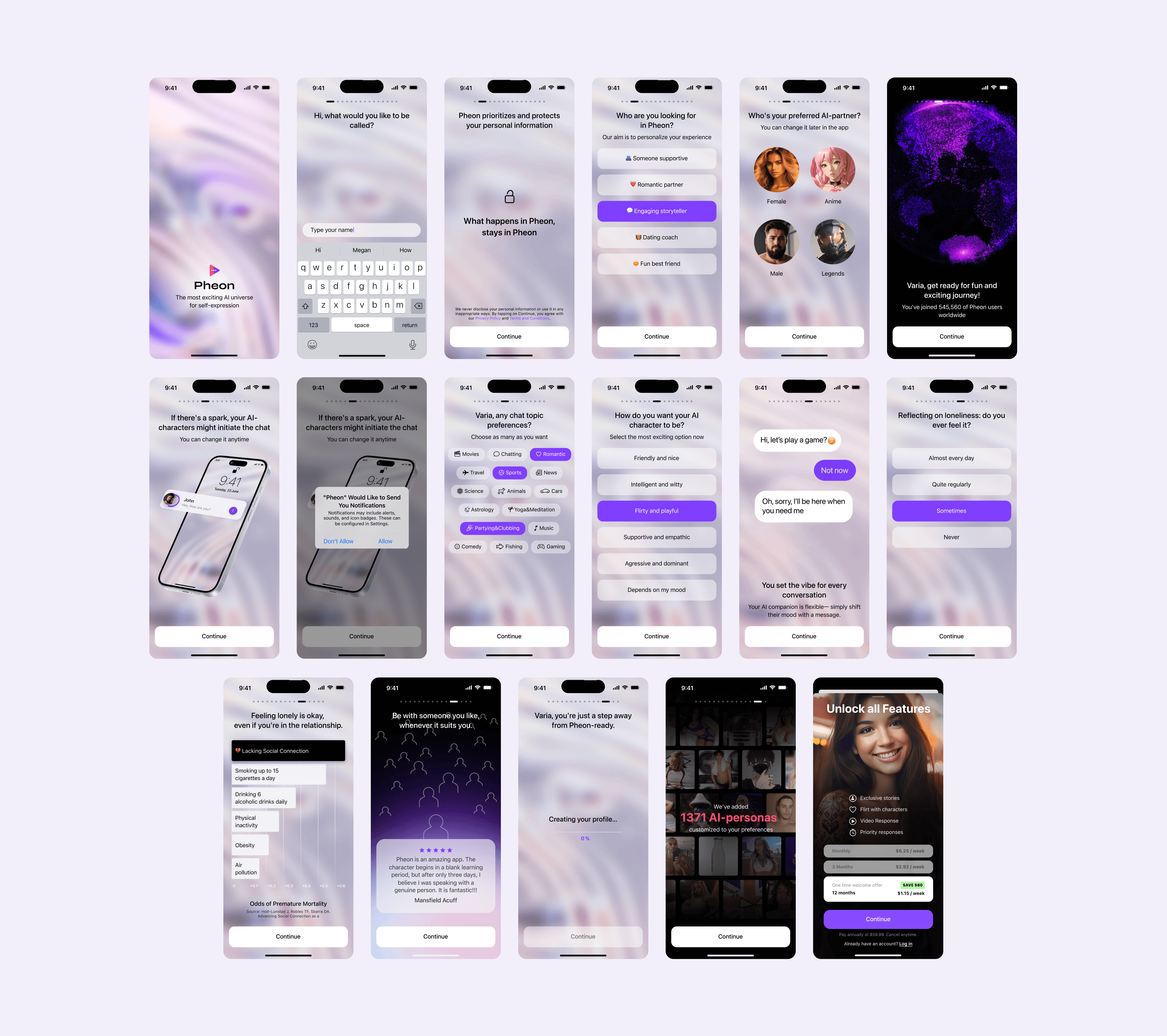
I built a high-fidelity animated prototype in Figma covering all scenario variants, intentionally overshooting on screens to test the full hypothesis space before cutting based on evidence. The new flow (Variant B): name + disclaimer → communication style → character category gallery → topic preferences → character customization → animated GIF chat preview → loading screen → account creation.
A/B Test
I segmented 5,000 users into two equal cohorts and set up event tracking in Amplitude across screen-level drop-off, account creation rate, D1/D7 retention, and conversion to paid. The test ran for two weeks.
Metric | Variant A (Short) | Variant B (8-10 screens) | Delta |
|---|---|---|---|
Account created (CR) | 88% | 75% | -13 pp |
Notification opt-in | 42% | 36% | -6 pp |
D1 Retention | 38% | 43% | +5 pp |
D7 Retention | 16% | 19% | +3 pp |
Conversion to Paid (Week 1) | 4.8% | 8.5% | +3.7 pp |
Outcome
The trade-off was intentional and data-defended. Variant B lost 13 pp at the top of the funnel and that was the point. Longer onboarding self-selected for users who were genuinely invested in the product before they ever sent a message.
In absolute numbers: Variant A produced 211 paid users from 4,400 accounts. Variant B produced 319 paid users from 3,750 accounts 108 more paying customers from a smaller, more committed cohort.
Fewer users came through the door. More of them paid. And the ones who paid stayed longer D7 retention up 3 pp, churn down, LTV compounding in Variant B's favor well beyond what any single metric captures.
The metric to watch wasn't conversion volume.
It was conversion quality. Onboarding isn't a UX formality. In a product where users are forming a connection with an AI, it's the first conversation the moment that sets emotional expectations and tells the user: this was made for someone like you.
What I’d do differently
Run a second iteration testing a mid-length variant (11 12 screens) could it recover some lost CR without sacrificing retention?
Instrument individual screen drop-off from day one some friction points only became visible in hindsight.
Test a progressive onboarding model collect minimal info upfront, deepen personalization inside the product after the first session.


